“Give me six hours to chop down a tree and I will spend the first 4 sharpening the axe”
– Abraham Lincoln, ages ago.
Explore possibilities and validate ideas with app prototyping. Test and revise at the design phase to get your digital product investor ready before you commit to development costs.
Our process
 Brainstorming
You have a great idea for an app, here is where you share your ideas with our experienced team and we bounce ideas around. Our aim is to fully understand your concept and generate a series of simple sketches of the main app screens. This is the most important step in the process, great things happen here.
 Iteration
Once we have the initial sketches drawn up, its time to question, review and revise. This process will reveal flaws and allow us to resolve any issues before more significant commitments are made. Its always good to introduce a fresh set of eyes at this part of the process, this is where we conduct the first in a series of user tests.
 UX Wireframes
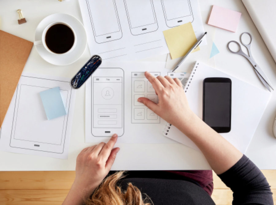
Next, we begin creating screens and assigning each function and data. This process often takes place on whiteboards or paper initially. You want to make changes here, rather than later in the process because it is much cheaper to erase some marks than to rewrite code. Once you have several screens drawn up, begin considering your app’s workflows.
 Work Flow Map
Workflows are the pathways users can travel within your app. Consider each of the things you want your users to be able to do and see how many clicks are needed to complete that action. Make sure each click is intuitive. If something takes a few clicks to accomplish, that might be fine, but it should not take a few clicks to perform common tasks.
 Apply the Branding
Rendered design is the process of taking your wireframes and replacing the grayscale elements with elements from your new style guide. There should be a rendered screen for each wireframe screen. We stay true to your style guide in this process, but you don’t have to be dogmatic about it. If you find yourself wanting a new or changed style, feel free to update or amend your style guides. We make sure your design is consistent when this stage is complete.
 Design Prototype
Click-through models help you test your wireframes and workflows. They are basically a way to experience your wireframes on a phone for more realistic testing. For example, you will simply receive a link, which when opened on your phone allows you to click through the wireframe. Although the app has no functionality at this point, you can click on each page in the app and begin testing the app’s navigation. As you find issues in this step, we make changes with your wireframes and iterate until you are satisfied.
